
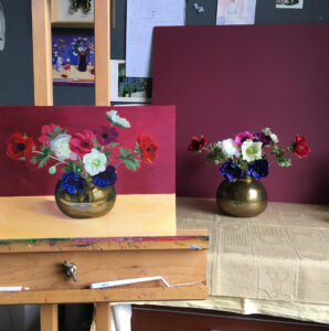
Materials Used
White Conte pencil
Gesso board
Daley Rowney System 3 Acrylic Paints; Titanium White, Lemon Yellow, Yellow Ochre, Cadmium Red, Crimson, Ultramarine Blue
Pro Arte Acrylic Brushes; Round 1, 3, 5, 7, Flat 3/8”
Composition
Poppy Anemones are a favourite flower of mine. They have rich vibrant colours, are relatively simple in design of the flower head, leaves and stem. Here I’ve placed them centrally in a brass bowl. The brass creates more of a challenge due to the reflective nature of the surface, you may choose to use a jug or vase that is a solid colour instead.
For the composition I have used the rule of thirds, one third foreground in yellow ochre and two thirds background in crimson. I added a little white to the yellow ochre and brushed the colour lightly over the surface with some water to dilute the paint. I then did the same with the Crimson but without adding any white.
Drawing out the composition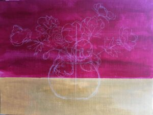
For this painting I start by eliminating the white of the page. By blocking in the foreground and background I am setting the tone of the painting and it can help the painting appear to come along more quickly.
I decided I wanted the flower arrangement to be central as there are no other objects within the painting. Using a white conté pencil I drew a central line down the middle of the page and from there drew in the bowl and flowers. I find it helpful to check my measurements; the height of the bowl was the same as the height from the top of the bowl to the top of the central flower. This then helps with the placement of the other flowers.
Limited palette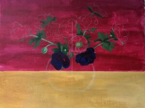
You will see from the list of colours that I have limited my palette to 2 yellows, 2 reds, 1 Blue plus White. I find that this is very helpful for teaching and encourages students to learn how to mix colours. I’ve started by painting in the stems and the leaves. To create the greens I’ve mixed lemon yellow, yellow ochre and ultramarine blue then added white for the highlights. For the blue flowers I’ve used Ultramarine then added Crimson to create the darker tones.
Paint in the flowers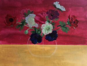
To paint in the rest of the flowers, for the red flowers I used Cadmium Red with added Crimson for the darker tones. The pink flower is Crimson mixed with a small amount of the White. Because we have already painted in the Crimson back ground we are building up the colour on top and can allow some of the Crimson to come through.
Whereas when it comes to painting the white flowers we will need to build them up in layers. I start by adding some Lemon Yellow to the White and a tiny amount of the green that I used for the leaves. Once each layer dries I will then go over it again with more of the White.
The purple flower is a mix of Cadmium Red and a small amount of Ultramarine Blue.
Study Light and Dark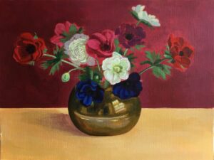
By painting in the Brass Bowl the painting really starts to come together. For the Brass Bowl I’ve used Yellow Ochre then added Ultramarine Blue for the darker tones. To create the highlights I’ve added Lemon Yellow and for the brightest highlights White. Because we’ve started with a Crimson background it means that the pink and red flowers are merging with the background. So I strengthened the colour within the flowers and then graduated the tone of the background. My light source within the studio comes from a window to the right of the still life so therefore there is more light visible on the right getting darker toward the left hand side.
Similarly with the foreground I’ve lightened it on the right and put in the shadow cast by the bowl on the left. Because the bowl is a reflective surface and the background is Crimson the Crimson is reflected in the shadow.
Add detail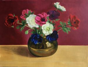
The final stages of the painting for me are refinement. I move towards smaller brushes to add more detail to the flowers. For the dark centre of the flowers I create black by mixing the Crimson with the Ultramarine Blue which creates a dark purple then if you add a tiny amount of Lemon Yellow the colour will go very dark creating something that looks like Black.
Overall I look at which tones need to go darker and which highlights need brightened. Increasing the darker tones in the brass bowl and then adding some warmer highlights really brings out the reflective qualities of the brass. If you look very closely you will see a reflection of me painting away!
Summery:
I enjoy rich colours and therefore I enjoyed painting this still life and it’s very important that you enjoy your subject too. If Crimson and Yellow are not for you, experiment with changing the background and foreground colours. As I stated at the beginning I have limited my palette and therefore the painting I’ve created is quite harmonious, in that all the colours sit well together. Painting should be about exploration and I repeated this same composition in Oils and using Mixed Media which I hope to share in the future. I hope this inspires you to give it a go.
Suzanne Kemplay 2022