Materials used:
- Daler Rowney System 3 Acrylic pad. A3
- Daler Rowney System 3 Acrylic paints: Cadmium Yellow, Yellow Ochre, Ultramarine Blue, Crimson Red, Sap Green, Burnt Umber and Titanium White
- Brushes; Synthetic round acrylic brush 1, 4
Synthetic flat acrylic brush 8 & 1/2″ filbert
The Composition
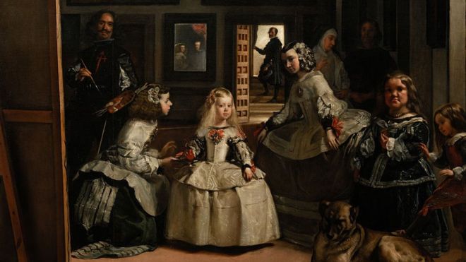
Key to my composition was the cardboard figure of Infante Margarita taken from Velazquez’s famous painting ‘Las Meninas’ painted in King Philip IV of Spain’s court in the 17th century. In ‘Las Meninas’ the infante is central to the composition but here I decided to place her at the left edge and instead placed a book on Velzaquez as the central object. Velzaquez manges to place himself centrally in the painting by putting in a mirror reflecting him painting the portrait.
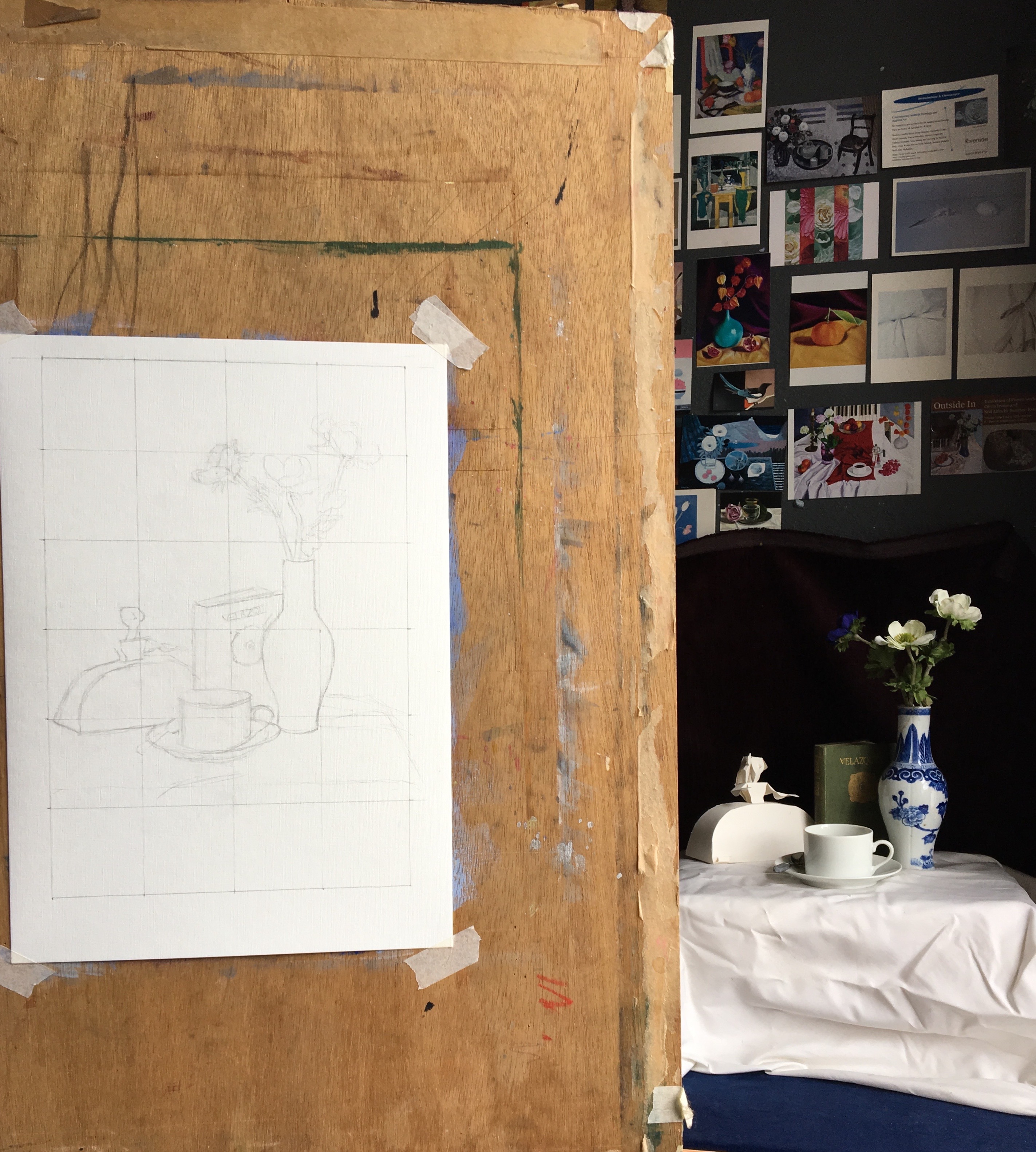
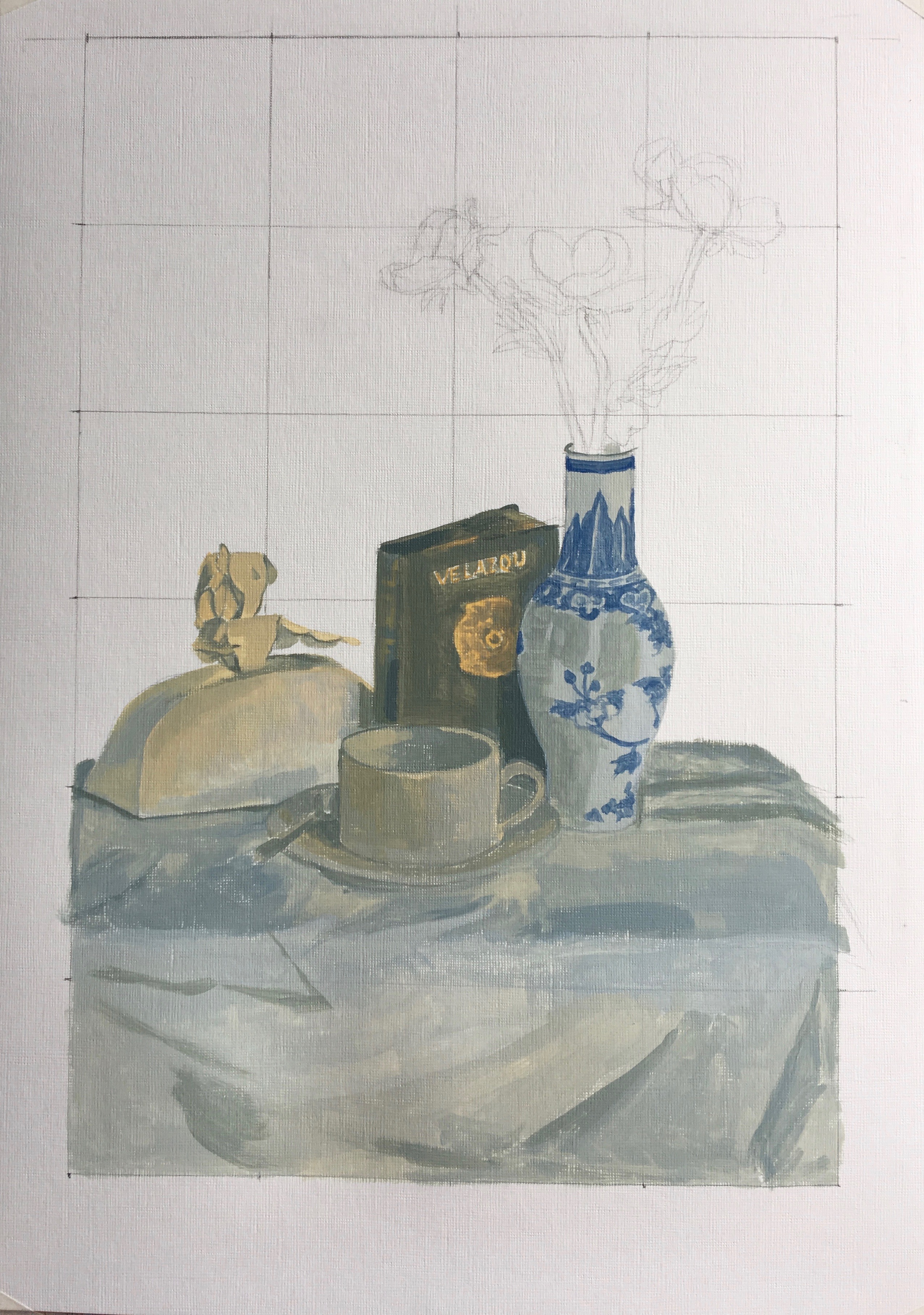
Tonal Underpainting
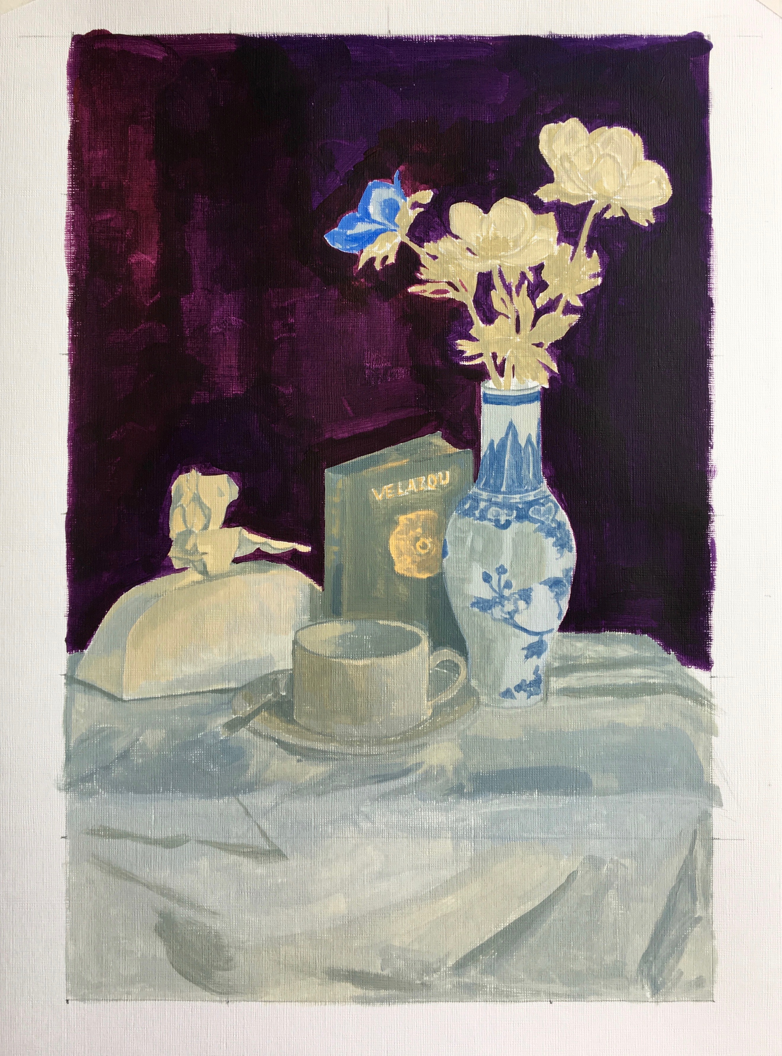
I start by doing a tonal underpainting using a limited palette of; yellow ochre, ultramarine blue and titanium white and use one of the larger flat brushes so that I cover the areas more quickly and don’t get caught up in too much detail. The tonal painting also helps to define the contrasts at an early stage and it is these contrasts that will give depth to your image, they get strengthen at a later stage. If you add too much colour at an early stage it can also be harder to see these contrasts.
Deepen the contrasts and add colour
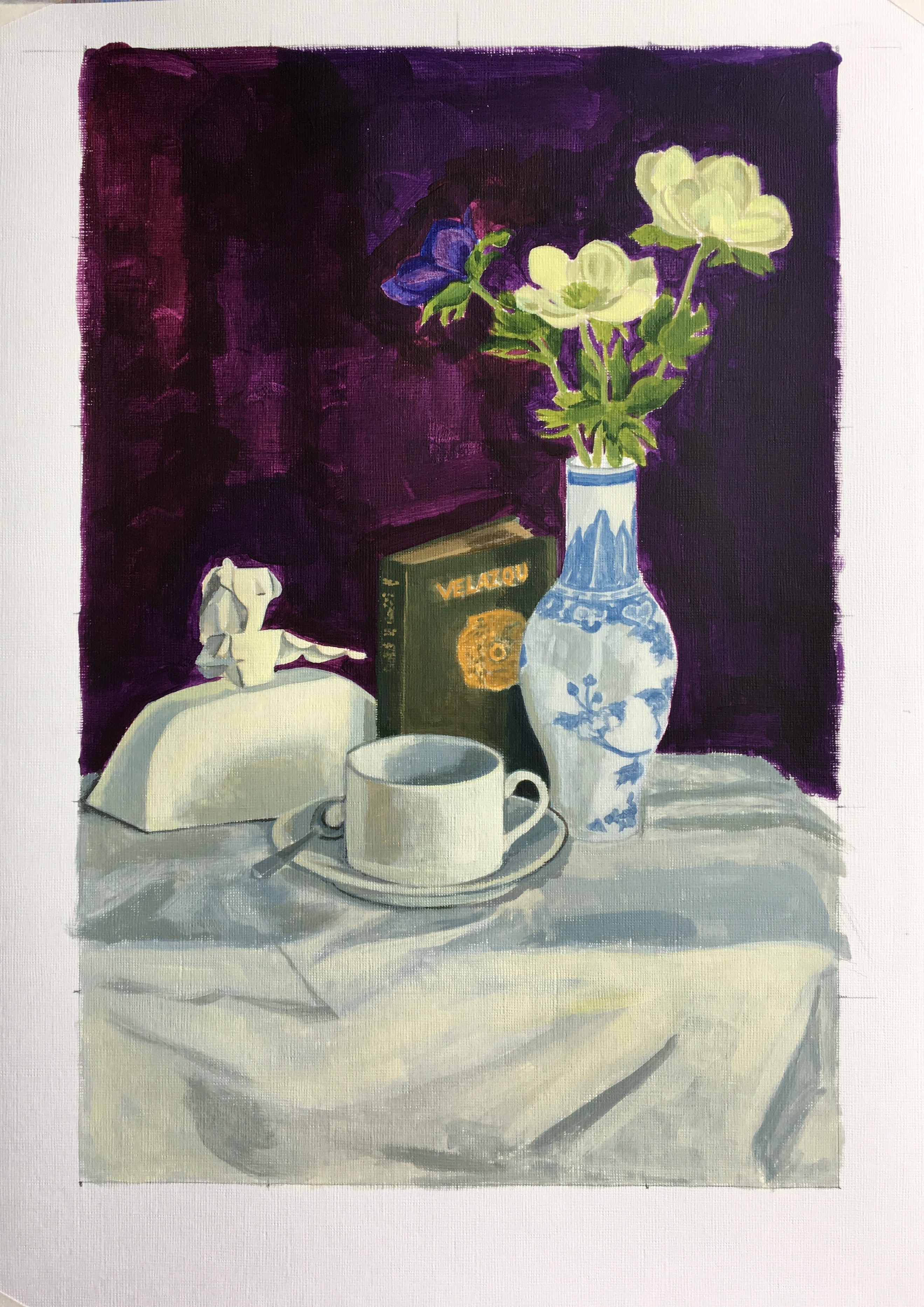
Once I have painted in all of the objects and flowers, I painted in the dark background mixing crimson red with the ultramarine blue. Now working with the round brushes I start to refine my painting of each of the objects. In the underpainting I created the light areas by adding yellow ochre to the titanium white but now I add a small amount of cadmium yellow which warms up the pale whites.